Black Gothic Shopify Store Design: Dark, Luxury and Minimal Layouts That Still Convert
Design principles for a black gothic Shopify store: readable contrast, restrained type, product photography on black, and layouts that keep dark stores converting.
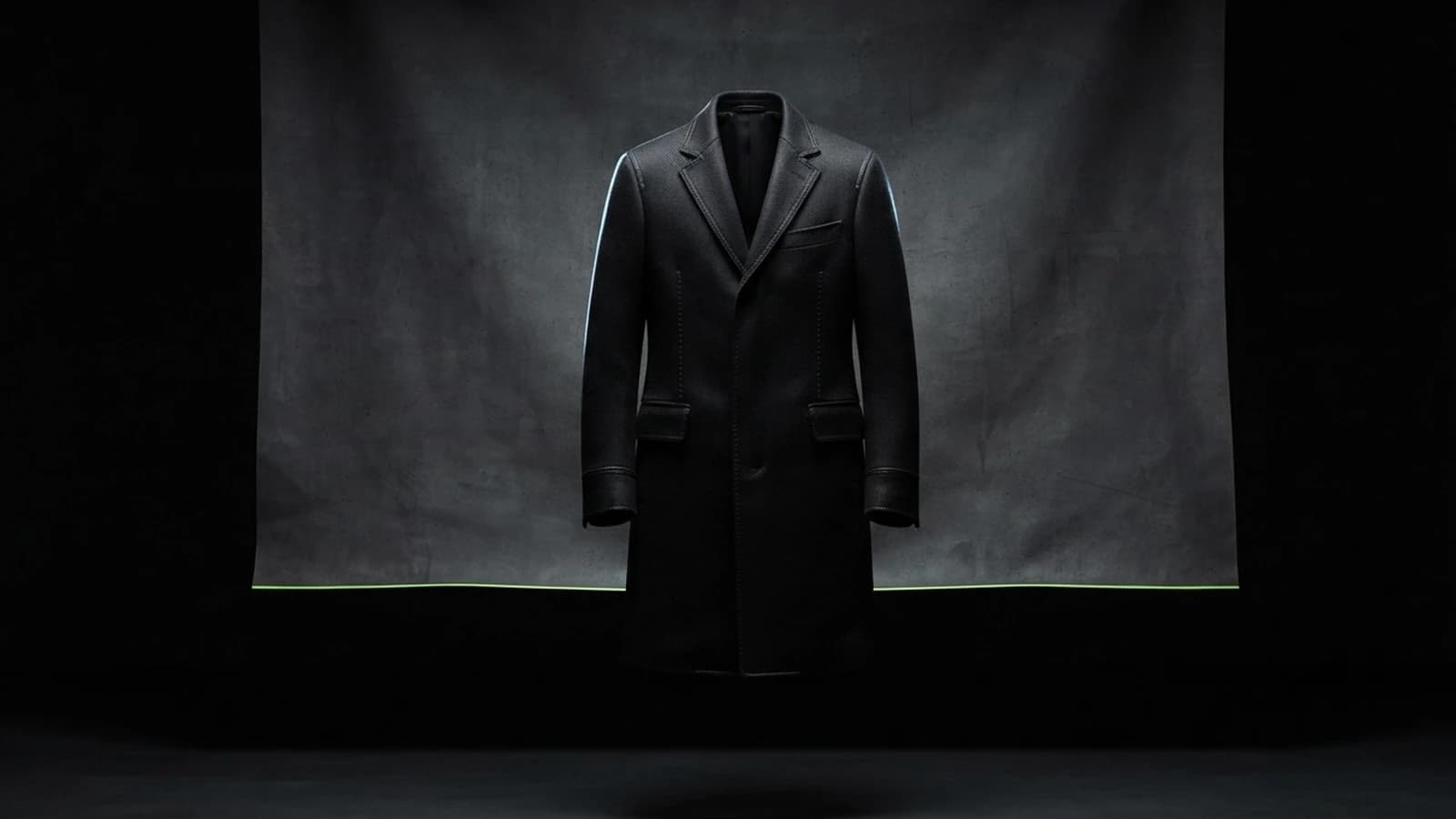
Why do black gothic stores struggle to convert?
Black gothic stores struggle to convert mainly because of readability and product visibility. Low-contrast text, black garments photographed against black backgrounds and decorative styling that hides buttons all make it harder for a shopper to understand and buy the product.
The fix is not to make the store less dark. It is to keep the mood in the surroundings while making prices, sizes, buttons and product details visually clear. Every principle below serves that split between atmosphere and function.
What contrast ratios should a dark Shopify store use?
A dark Shopify store should meet the WCAG 2.2 minimum contrast ratio of 4.5:1 for body text and 3:1 for large text and interface components. Pale grey on black often looks refined but drops below those ratios, especially on phones outdoors.
Use an off-white such as #e8e6e3 for body text on a near-black background like #0b0b0d, and reserve muted greys for decorative text only. Check the sale price colour, placeholder text and disabled buttons, since those are commonly missed. A free contrast checker takes seconds and settles the question.
How do I keep a black store from feeling flat?
Create depth with two or three near-black tones rather than one flat black. Use a slightly lighter charcoal for cards and footers, a thin low-opacity border to separate them, and one accent colour to draw the eye to actions.
Avoid heavy drop shadows, which barely show on black. Use borders, subtle gradients or lighter surfaces for layering. Limit the accent colour to buttons, links and highlights, so it always signals something clickable.
What is the difference between luxury and minimal gothic layouts?
A luxury gothic layout uses large imagery, serif typography, generous spacing and restrained detail to feel like a fashion house. A minimal gothic layout strips even that back to a monochrome grid, sans-serif type and very few elements.
- Luxury: editorial hero images, serif headings, thin gold or bone accent, slow fades, few products per row.
- Minimal: monochrome palette, small sans-serif labels, tight product grid, almost no decoration.
- Shared rule: both rely on whitespace, which on a dark store is empty dark space, to make products feel valuable.
Choose luxury if your prices and brand story support it, and minimal if your range is large and you need fast browsing. The subgenre styles behind each look are covered in goth store design by subgenre.
How should I photograph products for a black store?
Photograph dark garments with directional lighting that reveals texture, and use a slightly lifted charcoal or textured backdrop instead of pure black. Show at least one detail shot, because a black garment on black hides seams, lace and hardware.
Consistency matters more than the specific style: the same angle, crop and lighting across the catalogue makes the grid look designed. Add a lifestyle image on each product page so shoppers see fit and scale. For lookbook builds, see lookbooks and Instagram feeds for Shopify.
Which typography choices keep a dark store readable?
Choose one display font for headings and one clean font for body and interface text, and set body text at least 16px with generous line height. Thin, light font weights lose legibility on dark backgrounds, so avoid them for small text.
Light text on dark appears bolder than dark text on light, so a regular weight usually reads better than a medium one at body sizes. Keep decorative gothic or blackletter fonts for a logo or a single heading, never for prices or navigation.
How do I make sure the store still converts?
Keep the path to purchase visually clearer than the decoration. The add-to-cart button, size selector, price and shipping information should be the highest-contrast elements on a product page, and the checkout should be as simple as any other store's.
Test with real people on real phones, watch where they hesitate, and fix those spots first. To see how established brands handle this, read what good goth store designs do well, and for choosing a base theme, see what to look for in a dark fashion theme. If you want a dark store designed and coded so it converts, email me or see my Shopify work.
Frequently asked questions
What background colour works best for a black gothic Shopify store?
A near-black such as #0b0b0d works better than pure black, paired with off-white text. It keeps contrast high while avoiding glare and allows lighter charcoal surfaces for depth.
How do I photograph black clothing for an online store?
Use directional lighting to show texture, a lifted charcoal or textured backdrop, and include detail shots of seams, lace and hardware so the garment is not lost against a dark page.
Do dark websites convert worse than light ones?
Not inherently. Dark stores convert well when text contrast, product visibility and button clarity are handled. Poor readability, not the dark palette, is what hurts conversion.
What font size should body text be on a dark Shopify store?
Use at least 16px with generous line height and avoid very light font weights, which lose legibility on dark backgrounds.
Want this built on your store?
This is the kind of thing I build — custom-coded into your existing theme, no app and no monthly fee. Tell me what you need and I'll tell you what it takes, honestly, before you commit to anything.