Goth Store Design by Subgenre: Victorian, Cyber, Romantic & Punk
Victorian, cyber, romantic and punk goth each need a different palette, typeface, photography style and layout. A practical design guide for Shopify stores.
Why should a goth store be designed by subgenre?
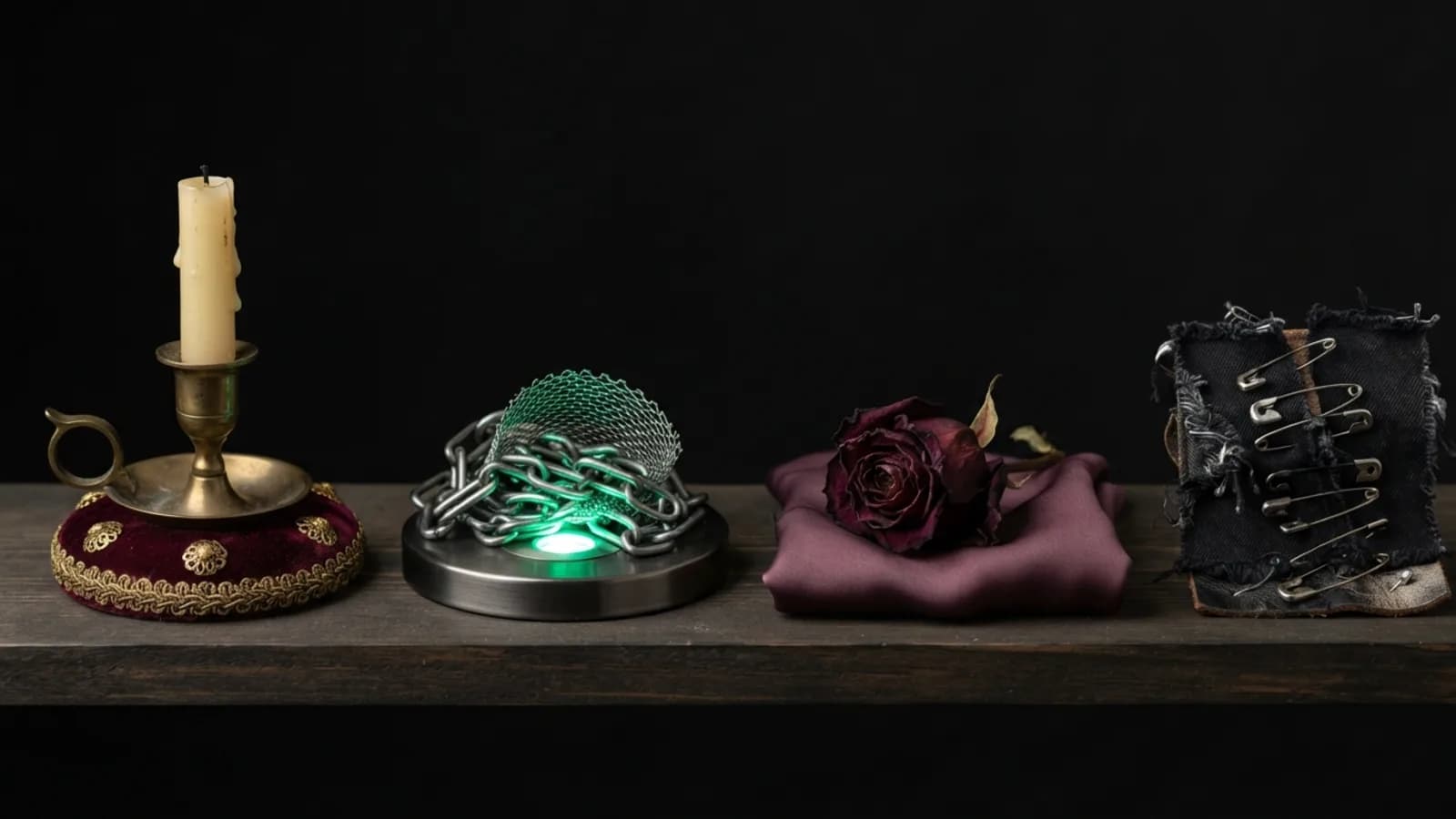
A goth store should be designed by subgenre because Victorian, cyber, romantic and punk goth customers respond to different visual signals. A single generic black-and-red look feels off to all four, while a store that commits to one subgenre reads as authentic and earns trust faster.
For each subgenre below, the same four decisions apply: palette, typography, imagery and layout. Decide these before choosing a theme, because layout is the hardest part to change later. Theme shortlisting is covered in what to look for in a dark fashion theme.
How do I design a Victorian goth Shopify store?
A Victorian goth Shopify store uses deep burgundy, aged gold and warm black, an ornate but readable serif typeface, and photography of lace, velvet and period-inspired styling. The layout should feel like an antique catalogue: centred headings, generous spacing and thin decorative dividers.
- Palette: warm black, burgundy, muted gold, parchment off-white for text.
- Type: a high-contrast serif such as Playfair Display or Cormorant Garamond for headings.
- Imagery: candlelit or window-lit portraits, texture close-ups, muted sepia grading.
- Layout: symmetrical, single-column storytelling, restrained animation.
How do I design a cybergoth Shopify store?
A cybergoth Shopify store uses near-black with UV neon accents such as acid green, magenta or electric blue, a geometric or monospaced typeface, and hard-edged product photography. The layout should feel technical: strict grids, small uppercase labels and visible structure.
- Palette: black, graphite, one neon accent used sparingly for buttons and highlights.
- Type: a grotesque or monospaced font, for example Space Grotesk or IBM Plex Mono.
- Imagery: high-contrast flash photography, industrial backdrops, cropped detail shots.
- Layout: dense grids, sharp corners, motion that feels mechanical rather than soft.
Neon on black is easy to overdo. Limit the accent to interactive elements so the page does not vibrate, and check contrast on the accent text.
How do I design a romantic goth Shopify store?
A romantic goth Shopify store uses plum, dusty rose and deep charcoal, a soft serif or restrained script for accents, and photography with shallow depth of field and flowing fabric. The layout should be airy and editorial, with large images and plenty of whitespace-equivalent dark space.
- Palette: charcoal, plum, faded rose, ivory text.
- Type: a soft serif for headings; use script only for small flourishes.
- Imagery: movement, drapery, floral details, natural or candle light.
- Layout: large full-bleed images, slow fades, generous margins.
Romantic goth is the subgenre most at risk of low-contrast text, since soft pastels on dark backgrounds can fall below readable levels. Test every pale colour against the background.
How do I design a punk goth Shopify store?
A punk goth Shopify store uses stark black, white and one harsh accent such as red, a condensed or stencil typeface, and rough, high-contrast photography with a photocopied texture. The layout should feel raw: overlapping elements, uneven alignment and bold oversized headings.
- Palette: black, off-white, one aggressive accent such as red.
- Type: a condensed sans like Oswald, or a stencil face used sparingly.
- Imagery: grainy, flash-lit, street or gig photography, torn-edge crops.
- Layout: asymmetric, oversized type, collage-style blocks.
Deliberate roughness still needs usability. Keep navigation, prices and buttons clean and predictable even when the surrounding style is messy.
Can one store combine several goth subgenres?
Yes, but a store should pick one primary subgenre for its site chrome and let collections express the others. Keep the header, footer, typography and buttons consistent, and vary only the imagery and accent colour on individual collection pages.
Mixing everything produces a store that looks generic. If your range genuinely spans subgenres, treat the primary look as the brand and use collection banners as the variation. I go deeper on dark-mode readability and product photography in black gothic store design that still converts.
How do I get the subgenre look into Shopify?
Set the palette in the theme's colour schemes, load the fonts through the theme settings or a Google Fonts import, and build the layout from the theme's sections. Where a section does not exist, such as a bespoke hero or lookbook, a custom-coded section fills the gap.
If you have a subgenre in mind and want it built precisely, see my Shopify work or email me the brief.
Frequently asked questions
What colours suit a Victorian goth clothing store?
Victorian goth stores suit warm black, burgundy and muted gold, with a parchment-toned off-white for text. Pair them with a high-contrast serif typeface.
What fonts work for a cybergoth Shopify store?
Geometric grotesque or monospaced fonts such as Space Grotesk or IBM Plex Mono suit cybergoth stores. Use one neon accent colour for buttons and highlights only.
How do I make a punk goth store still easy to use?
Keep navigation, prices and buttons clean and predictable, and confine the rough, collage-style styling to hero images and section backgrounds. Usability elements should never share the messy treatment.
Should I design separate stores for each goth subgenre?
Usually not. Choose one primary subgenre for the site design and express other subgenres through collection pages and photography, so the brand stays coherent.
Want this built on your store?
This is the kind of thing I build — custom-coded into your existing theme, no app and no monthly fee. Tell me what you need and I'll tell you what it takes, honestly, before you commit to anything.