How to Build a Mega Menu for a Big Fashion Catalogue in Shopify (No App)
Build a Shopify mega menu for a large fashion catalogue using native navigation and a small Liquid snippet. No app, no monthly fee, with collection images.
Why does a fashion store need a mega menu?
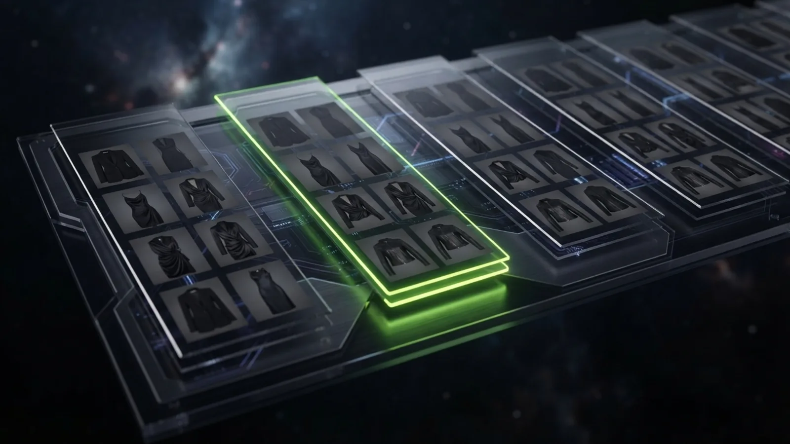
A fashion store needs a mega menu because a large clothing catalogue has too many categories for a single dropdown. Goth and alternative stores often split by garment, subgenre and occasion, and a mega menu shows those groups at once so shoppers reach a collection in one click.
A menu that hides categories behind several nested hovers loses shoppers on mobile and on slow connections. A well-built mega menu shows headings, links and one or two featured collection images together, which mirrors how people browse a physical rail of clothes.
Can I build a Shopify mega menu without an app?
Yes. Shopify's native navigation supports three levels of links, and a Liquid snippet can render those levels as a multi-column panel. This needs no app and no monthly fee, and it adds only a small amount of HTML and CSS to the page.
The structure lives in Content, then Menus, in the Shopify admin. Level one is the top navigation item, level two becomes a column heading and level three becomes the links in that column. Because the menu data stays in Shopify, a non-developer can edit it later without touching code.
How do I structure the menu in the Shopify admin?
Create a menu with top-level items such as Clothing, Footwear and Accessories. Under Clothing add column headings such as Tops, Dresses and Corsetry, and under each heading add the collection links. Save the menu with the handle main-menu.
Keep column headings to five or fewer per top-level item, and fewer than eight links per column. Long lists become a wall of text and push the important collections below the fold on laptop screens.
What does the Liquid snippet look like?
The snippet loops through linklists['main-menu'], renders each top-level link, and renders its child and grandchild links inside a panel. Save it as snippets/mega-menu.liquid and render it in the header with {% render 'mega-menu' %}.
<nav class="mega" aria-label="Main">
  <ul class="mega__top">
    {%- for link in linklists['main-menu'].links -%}
      <li class="mega__item">
        <a href="{{ link.url }}" {% if link.links.size > 0 %}aria-haspopup="true"{% endif %}>{{ link.title }}</a>
        {%- if link.links.size > 0 -%}
          <div class="mega__panel">
            {%- for child in link.links -%}
              <div class="mega__col">
                <a class="mega__heading" href="{{ child.url }}">{{ child.title }}</a>
                <ul>
                  {%- for grandchild in child.links -%}
                    <li><a href="{{ grandchild.url }}">{{ grandchild.title }}</a></li>
                  {%- endfor -%}
                </ul>
              </div>
            {%- endfor -%}
          </div>
        {%- endif -%}
      </li>
    {%- endfor -%}
  </ul>
</nav>
How do I style the mega menu and make it work on a dark store?
Position the panel absolutely under the header, lay the columns out with CSS grid, and show the panel on hover and on keyboard focus. Use your dark colour scheme variables so the panel matches the rest of the store.
.mega__item { position: static; }
.mega__panel {
  position: absolute; left: 0; right: 0;
  display: none;
  grid-template-columns: repeat(auto-fit, minmax(160px, 1fr));
  gap: 2rem; padding: 2rem;
  background: #0b0b0d;
  border-top: 1px solid rgba(255,255,255,.08);
}
.mega__item:hover .mega__panel,
.mega__item:focus-within .mega__panel { display: grid; }
The :focus-within rule matters for accessibility, because it opens the panel for keyboard users. On mobile, replace the hover panel with a stacked accordion or your theme's drawer menu, since hover does not exist on touch screens.
How do I add collection images to the mega menu?
Shopify exposes the linked collection on a menu link through link.object, so the snippet can show that collection's featured image. Check link.type == 'collection_link' first, then output link.object.featured_image with the image_url filter.
{%- if child.type == 'collection_link' and child.object.featured_image -%}
  {{ child.object.featured_image | image_url: width: 320 | image_tag: loading: 'lazy', alt: child.title }}
{%- endif -%}
Keep these images small and lazy-loaded so the header does not slow every page. On a dark goth store, one striking image beside the columns does more than several thumbnails.
What are the pitfalls of a custom mega menu?
The main pitfalls are accessibility, mobile behaviour and page weight. A mega menu built only for hover excludes keyboard and touch users, and oversized menu images slow every page because the header loads everywhere.
Test with the Tab key, test on a real phone, and keep menu images under a small size. If you would like a mega menu built to your catalogue, email me or see my Shopify services. To choose a theme that already ships one, read what to look for in a dark fashion theme, and for the next feature a large catalogue needs, see product filtering and size charts.
Frequently asked questions
How many levels does a Shopify menu support?
Shopify navigation menus support three levels: a top-level link, child links and grandchild links. A mega menu uses these as the top item, column headings and column links.
Do I need an app for a Shopify mega menu?
No. A mega menu can be built with Shopify's native menus and a Liquid snippet, with no app and no subscription.
How do I make a Shopify mega menu accessible?
Open the panel on keyboard focus as well as hover using the CSS `:focus-within` selector, keep links in a logical tab order, and provide a stacked menu for mobile.
Will a mega menu slow my Shopify store?
A well-built one adds little weight. Keep menu images small and lazy-loaded, because the header renders on every page.
Want this built on your store?
This is the kind of thing I build — custom-coded into your existing theme, no app and no monthly fee. Tell me what you need and I'll tell you what it takes, honestly, before you commit to anything.